Theme Question: Theming the inspection bar/labels

I maintain a theme called Trash Panda Theme. It was recently brought to my attention that the numbers/count next to the inspection icons in the top-right of the editor are invisible due to color settings.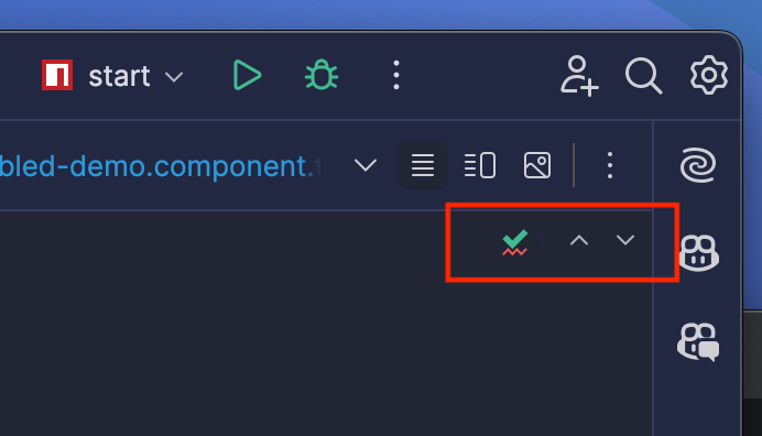
I am unable to identify which theme properties I need to update in order to set the text color within the labels.
The text is somewhat visible when hovering over the buttons/labels but still very difficult to read.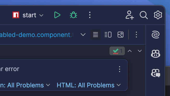
Using the UI Inspector, these text labels are `JLabel` elements within a `TrafficLightButton`. According to the inspector, the color is inherited from the `Label.foreground` value. However, this value does not match the `Label.foreground` value set in my theme.json. Furthermore, the parent of the `TrafficLightButton` is a `ActionToolbarImpl` and it's `foreground` properties is inherited from `Panel.foreground` which is the correct color set in my theme.json. Changing either of these theme properties has no affect on these labels.
Here is the full theme.json file associated with the theme variation shown in the above screenshots:
{
    "name": "Trash Panda Theme (Starlight)",
    "dark": true,
    "author": "Jason Hulbert",
    "editorScheme": "/trash-panda-theme-starlight.xml",
    "colors": {
        "transparent": "#00000000",
        "translucent": "#00000050",
        "base1": "#222533",
        "base2": "#222842",
        "base3": "#333c63",
        "base4": "#445084",
        "base5": "#69739d",
        "base6": "#b4b9ce",
        "base7": "#dadce6",
        "base8": "#FFFFFF",
        "accent": "#79c1f5",
        "accent_mod1": "#5b91b8",
        "accent_mod2": "#3d617b",
        "accent_mod3": "#1e303d",
        "lime": "#8ec475",
        "lime_mod1": "#6b9358",
        "lime_mod2": "#47623b",
        "lime_mod3": "#24311d",
        "green": "#42ba90",
        "green_mod1": "#328b6c",
        "green_mod2": "#215d48",
        "green_mod3": "#102f24",
        "blue": "#2c99db",
        "blue_mod1": "#2173a4",
        "blue_mod2": "#113A52",
        "blue_mod3": "#0B2637",
        "cyan": "#50cae5",
        "cyan_mod1": "#3c98ac",
        "cyan_mod2": "#1E4C56",
        "cyan_mod3": "#143239",
        "purple": "#A07CF1",
        "purple_mod1": "#785DB5",
        "purple_mod2": "#3C2F5B",
        "purple_mod3": "#281F3C",
        "pink": "#DC6096",
        "pink_mod1": "#A54871",
        "pink_mod2": "#532439",
        "pink_mod3": "#371826",
        "red": "#F05553",
        "red_mod1": "#B4403E",
        "red_mod2": "#5A201F",
        "red_mod3": "#3C1515",
        "orange": "#F07F5B",
        "orange_mod1": "#B45F44",
        "orange_mod2": "#5A3022",
        "orange_mod3": "#3C2017",
        "yellow": "#dcc37c",
        "yellow_mod1": "#a5925d",
        "yellow_mod2": "#6e623e",
        "yellow_mod3": "#37311f"
    },
    "ui": {
        "*": {
            "windowBorder": "base2",
            "borderColor": "base3",
            "background": "base2",
            "foreground": "base6",
            "inactiveBackground": "base2",
            "inactiveForeground": "base6",
            "selectionBackground": {
              "os.default": "base3",
              "os.windows": "base3",
              "os.mac": "base3"
            },
            "selectionForeground": {
              "os.default": "base7",
              "os.windows": "base7",
              "os.mac": "base7"
            },
            "selectionInactiveBackground": "base3",
            "selectionInactiveForeground": "base6",
            "acceleratorSelectionBackground": "base3",
            "acceleratorSelectionForeground": "base7",
            "focusColor": "accent_mod2",
            "focusedBorderColor": "accent_mod2"
        },

        "ActionButton.hoverBackground": "base1",
        "ActionButton.hoverBorderColor": "base1",
        "ActionButton.pressedBackground": "base1",
        "ActionButton.pressedBorderColor": "base1",
        "ActionButton.separatorColor": "base3",

        "Borders.color": "base3",
        "Borders.ContrastBorderColor": "base3",

        "Button.arc": 8,
        "Button.background": "base2",
        "Button.foreground": "accent",
        "Button.startBackground": "base1",
        "Button.endBackground": "base1",
        "Button.startBorderColor": "base1",
        "Button.endBorderColor": "base1",
        "Button.shadowColor": "base1",
        "Button.disabledBorderColor": "base1",
        "Button.disabledText": "base4",
        "Button.focusedBorderColor": "accent_mod2",

        "Button.default.foreground": "accent",
        "Button.default.startBackground": "base1",
        "Button.default.endBackground": "base1",
        "Button.default.startBorderColor": "accent",
        "Button.default.endBorderColor": "accent",
        "Button.default.focusedBorderColor": "accent_mod2",
        "Button.default.shadowColor": "base1",

        "CheckBox.background": "base2",
        "CheckBox.disabledText": "base4",
        "CheckBox.foreground": "base6",
        "CheckBox.select": "accent",

        "CheckBoxMenuItem.acceleratorForeground": "base6",
        "CheckBoxMenuItem.background": "base2",
        "CheckBoxMenuItem.disabledBackground": "base2",
        "CheckBoxMenuItem.disabledForeground": "base4",
        "CheckBoxMenuItem.foreground": "base6",

        "ComboBox.background": "base1  ",
        "ComboBox.disabledForeground": "base4",
        "ComboBox.foreground": "base7",
        "ComboBox.modifiedItemForeground": "base7",
        "ComboBox.nonEditableBackground": "base1",

        "ComboBox.ArrowButton.background": "base1",
        "ComboBox.ArrowButton.disabledIconColor": "base4",
        "ComboBox.ArrowButton.iconColor": "accent",
        "ComboBox.ArrowButton.nonEditableBackground": "base1",

        "ComboBoxButton.background": "base1",

        "ComboPopup.border": "1,1,1,1,333c63",

        "Component.borderColor": "base3",
        "Component.infoForeground": "base5",
        "Component.disabledBorderColor": "base4",
        "Component.focusColor": "accent_mod2",
        "Component.focusedBorderColor": "accent_mod2",
        "Component.errorFocusColor": "red_mod2",
        "Component.inactiveErrorFocusColor": "red_mod3",
        "Component.warningFocusColor": "orange_mod2",
        "Component.inactiveWarningFocusColor": "orange_mod3",

        "DefaultTabs.borderColor": "base3",
        "DefaultTabs.hoverBackground": "base1",
        "DefaultTabs.inactiveUnderlineColor": "accent_mod2",
        "DefaultTabs.underlineColor": "accent",
        "DefaultTabs.underlinedTabForeground": "base7",
        "DefaultTabs.underlinedTabBackground": "base1",
        "DefaultTabs.underlineHeight": 2,

        "DragAndDrop.areaForeground": "base7",
        "DragAndDrop.areaBackground": "accent_mod3",
        "DragAndDrop.borderColor": "accent",

        "Editor.SearchField.background": "base1",

        "Editor.background": "base2",
        "Editor.foreground": "base7",
        "Editor.shortcutForeground": "accent",

        "EditorPane.background": "base1",
        "EditorPane.caretForeground": "accent",
        "EditorPane.foreground": "base6",
        "EditorPane.inactiveForeground": "base6",
        "EditorPane.inactiveBackground": "base2",
        "EditorPane.selectionForeground": "base7",

        "EditorTabs.borderColor": "base3",
        "EditorTabs.hoverBackground": "base2",
        "EditorTabs.inactiveColoredFileBackground": "base2",
        "EditorTabs.inactiveUnderlineColor": "accent_mod2",
        "EditorTabs.underlineColor": "accent",
        "EditorTabs.underlinedTabBackground": "base1",
        "EditorTabs.underlinedTabForeground": "base7",

        "FileColor.Blue": "blue_mod3",
        "FileColor.Green": "green_mod3",
        "FileColor.Orange": "orange_mod3",
        "FileColor.Rose": "pink_mod3",
        "FileColor.Violet": "purple_mod3",
        "FileColor.Yellow": "yellow_mod3",

        "FormattedTextField.background": "base1",
        "FormattedTextField.caretForeground": "accent",
        "FormattedTextField.foreground": "base7",

        "IconBadge.errorBackground": "red",
        "IconBadge.infoBackground": "accent",
        "IconBadge.successBackground": "green",
        "IconBadge.warningBackground": "orange",

        "Label.foreground": "base6",
        "Label.background": "base2",
        "Label.selectedForeground": "base7",
        "Label.disabledForeground": "base4",
        "Label.infoForeground": "blue",
        "Label.successForeground": "green",
        "Label.errorForeground": "red",

        "List.dropLineColor": "base3",
        "List.foreground": "base6",
        "List.hoverBackground": "base1",
        "List.hoverInactiveBackground": "base2",

        "Link.activeForeground": "accent",
        "Link.hoverForeground": "accent",
        "Link.pressedForeground": "accent",
        "Link.secondaryForeground": "accent_mod1",
        "Link.visitedForeground": "accent",

        "MemoryIndicator.usedBackground": "green_mod2",
        "MemoryIndicator.allocatedBackground": "base4",

        "Menu.acceleratorForeground": "base6",
        "Menu.borderColor": "base3",
        "Menu.disabledBackground": "base2",
        "Menu.disabledForeground": "base4",
        "Menu.foreground": "base6",

        "MenuBar.borderColor": "base3",
        "MenuBar.disabledBackground": "base2",
        "MenuBar.disabledForeground": "base4",
        "MenuBar.foreground": "base6",
        "MenuBar.highlight": "base7",
        "MenuBar.shadow": "transparent",

        "MenuItem.acceleratorForeground": "base6",
        "MenuItem.disabledBackground": "base2",
        "MenuItem.disabledForeground": "base4",
        "MenuItem.foreground": "base6",

        "NavBar.borderColor": "base3",

        "Notification.foreground": "base6",
        "Notification.borderColor": "base3",
        "Notification.errorBackground": "red_mod3",
        "Notification.errorForeground": "red",
        "Notification.errorBorderColor": "red",

        "Notification.MoreButton.background": "transparent",
        "Notification.MoreButton.foreground": "accent",
        "Notification.MoreButton.innerBorderColor": "transparent",

        "Notification.ToolWindow.errorBackground": "red_mod3",
        "Notification.ToolWindow.errorBorderColor": "red",
        "Notification.ToolWindow.errorForeground": "red",
        "Notification.ToolWindow.informativeBackground": "blue_mod3",
        "Notification.ToolWindow.informativeBorderColor": "blue",
        "Notification.ToolWindow.informativeForeground": "blue",
        "Notification.ToolWindow.warningBackground": "orange_mod3",
        "Notification.ToolWindow.warningBorderColor": "orange",
        "Notification.ToolWindow.warningForeground": "orange",

        "Panel.foreground": "base6",
        "Panel.background": "base2",

        "ParameterInfo.foreground": "base4",
        "ParameterInfo.currentOverloadBackground": "base8",
        "ParameterInfo.currentParameterForeground": "base7",

        "Plugins.Button.installForeground": "base1",
        "Plugins.Button.installBackground": "green",
        "Plugins.Button.installBorderColor": "green",
        "Plugins.Button.installFocusedBackground": "green",
        "Plugins.Button.installFillForeground": "base1",
        "Plugins.Button.installFillBackground": "green",
        "Plugins.Button.updateForeground": "base1",
        "Plugins.Button.updateBackground": "accent",

        "Plugins.SearchField.background": "base1",

        "Plugins.tagBackground": "accent",
        "Plugins.tagForeground": "base1",
        "Plugins.lightSelectionBackground": "base3",
        "Plugins.hoverBackground": "accent_mod3",

        "Popup.paintBorder": true,
        "Popup.borderColor": "base3",
        "Popup.innerBorderColor": "base3",
        "Popup.inactiveBorderColor": "base3",

        "Popup.Advertiser.foreground": "base6",
        "Popup.Advertiser.background": "base2",
        "Popup.Advertiser.borderColor": "base3",
        "Popup.Advertiser.borderInsets": "3,8,5,0",

        "Popup.Header.activeBackground": "base2",
        "Popup.Header.activeForeground": "base6",

        "Popup.Toolbar.background": "base2",
        "Popup.Toolbar.borderColor": "base3",

        "PopupMenu.background": "base2",
        "PopupMenu.foreground": "base6",
        "PopupMenu.translucentBackground": "translucent",

        "ProblemsView.projectAnalysisButtonBackground": "green_mod2",

        "ProgressBar.trackColor": "base2",
        "ProgressBar.progressColor": "accent",
        "ProgressBar.indeterminateStartColor": "accent",
        "ProgressBar.indeterminateEndColor": "accent_mod3",
        "ProgressBar.failedColor": "red",
        "ProgressBar.failedEndColor": "red_mod3  ",
        "ProgressBar.passedColor": "green",
        "ProgressBar.passedEndColor": "green_mod3",

        "RadioButton.background": "base2",
        "RadioButton.disabledText": "base4",
        "RadioButton.foreground": "base6",

        "RadioButtonMenuItem.foreground": "base6",
        "RadioButtonMenuItem.background": "base2",
        "RadioButtonMenuItem.disabledBackground": "base2",
        "RadioButtonMenuItem.disabledForeground": "base4",
        "RadioButtonMenuItem.acceleratorForeground": "base6",

        "RunToolbar.Debug.activeBackground": "red_mod3",
        "RunToolbar.Profile.activeBackground": "accent_mod3",
        "RunToolbar.Run.activeBackground": "green_mod3",

        "RunWidget.foreground": "base7",
        "RunWidget.iconColor": "base7",
        "RunWidget.hoverBackground": "",
        "RunWidget.pressedBackground": "",
        "RunWidget.runIconColor": "green",
        "RunWidget.runningIconColor": "base1",
        "RunWidget.runningBackground": "green",

        "ScrollBar.trackColor": "base2",
        "ScrollBar.thumbColor": "base3",
        "ScrollBar.thumbBorderColor": "base3",
        "ScrollBar.hoverThumbColor": "base3",
        "ScrollBar.hoverThumbBorderColor": "base3",
        "ScrollBar.hoverTrackColor": "base1",

        "ScrollBar.Transparent.trackColor": "transparent",
        "ScrollBar.Transparent.thumbColor": "base3",
        "ScrollBar.Transparent.thumbBorderColor": "base3",
        "ScrollBar.Transparent.hoverThumbColor": "base3",
        "ScrollBar.Transparent.hoverThumbBorderColor": "base3",
        "ScrollBar.Transparent.hoverTrackColor": "base1",

        "ScrollBar.Mac.trackColor": "base2",
        "ScrollBar.Mac.thumbColor": "base3",
        "ScrollBar.Mac.thumbBorderColor": "base3",
        "ScrollBar.Mac.hoverThumbColor": "base3",
        "ScrollBar.Mac.hoverThumbBorderColor": "base3",
        "ScrollBar.Mac.hoverTrackColor": "base1",

        "ScrollBar.Mac.Transparent.trackColor": "transparent",
        "ScrollBar.Mac.Transparent.thumbColor": "base3",
        "ScrollBar.Mac.Transparent.thumbBorderColor": "base3",
        "ScrollBar.Mac.Transparent.hoverThumbColor": "base3",
        "ScrollBar.Mac.Transparent.hoverThumbBorderColor": "base3",
        "ScrollBar.Mac.Transparent.hoverTrackColor": "base1",

        "SearchEverywhere.Advertiser.background": "base2",
        "SearchEverywhere.Advertiser.foreground": "base6",

        "SearchEverywhere.Header.background": "base2",

        "SearchEverywhere.List.separatorColor": "base3",
        "SearchEverywhere.List.separatorForeground": "base5",

        "SearchEverywhere.SearchField.background": "base1",
        "SearchEverywhere.SearchField.borderColor": "base3",
        "SearchEverywhere.SearchField.infoForeground": "base5",

        "SearchEverywhere.Tab.selectedBackground": "base1",
        "SearchEverywhere.Tab.selectedForeground": "base7",

        "SearchField.errorBackground": "red_mod3",
        "SearchField.errorForeground": "red",


        "SearchMatch.endBackground": "accent",
        "SearchMatch.startBackground": "accent",


        "SidePanel.background": "base2",

        "StatusBar.borderColor": "base3",

        "TabbedPane.background": "base2",
        "TabbedPane.contentAreaColor": "base2",
        "TabbedPane.disabledForeground": "base4",
        "TabbedPane.disabledUnderlineColor": "base4",
        "TabbedPane.focus": "base7",
        "TabbedPane.focusColor": "accent_mod2",
        "TabbedPane.foreground": "base6",
        "TabbedPane.hoverColor": "base1",
        "TabbedPane.underlineColor": "accent",

        "Table.foreground": "base6",
        "Table.gridColor": "base3",
        "Table.dropLineColor": "base3",
        "Table.dropLineShortColor": "base3",
        "Table.sortIconColor": "accent",
        "Table.stripeColor": "base3",
        "Table.lightSelectionForeground": "accent",
        "Table.lightSelectionInactiveForeground": "accent",
        "Table.lightSelectionBackground": "base3",
        "Table.lightSelectionInactiveBackground": "base3",

        "Tag.background": "accent_mod1",

        "TextArea.background": "base1",
        "TextArea.foreground": "base7",

        "TextField.background": "base1",
        "TextField.caretForeground": "accent",
        "TextField.darkShadow": "transparent",
        "TextField.foreground": "base7",
        "TextField.highlight": "transparent",

        "ToggleButton.background": "base1",
        "ToggleButton.borderColor": "base3",
        "ToggleButton.buttonColor": "base2",
        "ToggleButton.disabledText": "base4",
        "ToggleButton.foreground": "base6",
        "ToggleButton.offBackground": "base2",
        "ToggleButton.offForeground": "base5",
        "ToggleButton.onBackground": "accent",
        "ToggleButton.onForeground": "base1",

        "ToolBar.foreground": "base6",
        "ToolBar.background": "base2",
        "ToolBar.floatingForeground": "base6",
        "Toolbar.Floating.background": "base2",
        "Toolbar.Floating.borderColor": "base4",

        "ToolWindow.background": "base2",

        "ToolWindow.Button.hoverBackground": "base1",
        "ToolWindow.Button.selectedForeground": "base7",
        "ToolWindow.Button.selectedBackground": "base1",

        "ToolWindow.Header.background": "base2",
        "ToolWindow.Header.borderColor": "base3",
        "ToolWindow.HeaderTab.hoverBackground": "base1",
        "ToolWindow.HeaderTab.hoverInactiveBackground": "base2",
        "ToolWindow.HeaderTab.selectedInactiveBackground": "base2",
        "ToolWindow.HeaderTab.underlineColor": "accent",
        "ToolWindow.HeaderTab.inactiveUnderlineColor": "accent_mod2",
        "ToolWindow.HeaderTab.underlinedTabBackground": "base1",
        "ToolWindow.HeaderTab.underlinedTabInactiveBackground": "base1",
        "ToolWindow.HeaderCloseButton.background": "base1",

        "ToolTip.background": "base2",
        "ToolTip.foreground": "base6",
        "ToolTip.infoForeground": "base5",

        "ToolTip.Actions.background": "base2",
        "ToolTip.Actions.infoForeground": "base6",

        "Tree.background": "base2",
        "Tree.errorForeground": "red",
        "Tree.foreground": "base6",
        "Tree.hoverBackground": "base2",
        "Tree.hoverInactiveBackground": "base2",
        "Tree.selectionForeground": "accent",
        "Tree.selectionBackground": "base3",
        "Tree.selectionInactiveBackground": "base3",
        "Tree.modifiedItemForeground": "blue",
        "Tree.rowHeight": "26",

        "ValidationTooltip.errorBackground": "red_mod3",
        "ValidationTooltip.errorBorderColor": "red",
        "ValidationTooltip.warningBackground": "orange_mod3",
        "ValidationTooltip.warningBorderColor": "orange",

        "VersionControl.FileHistory.Commit.selectedBranchBackground": "accent_mod3",

        "VersionControl.GitLog.headIconColor": "yellow",
        "VersionControl.GitLog.localBranchIconColor": "green",
        "VersionControl.GitLog.otherIconColor": "base4",
        "VersionControl.GitLog.remoteBranchIconColor": "purple",
        "VersionControl.GitLog.tagIconColor": "base4",

        "VersionControl.HgLog.bookmarkIconColor": "pink",
        "VersionControl.HgLog.branchIconColor": "accent",
        "VersionControl.HgLog.closedBranchIconColor": "red",
        "VersionControl.HgLog.headIconColor": "red",
        "VersionControl.HgLog.localTagIconColor": "blue",
        "VersionControl.HgLog.mqTagIconColor": "base4",
        "VersionControl.HgLog.tagIconColor": "base4",
        "VersionControl.HgLog.tipIconColor": "yellow",

        "VersionControl.Log.Commit.currentBranchBackground": "base3",
        "VersionControl.Log.Commit.hoveredBackground": "base2",
        "VersionControl.Log.Commit.unmatchedForeground": "base5",
        "VersionControl.RefLabel.backgroundBase": "base1",
        "VersionControl.RefLabel.foreground": "base6",

        "WelcomeScreen.separatorColor": "base3",

        "Window.border": "1,1,1,1,333c63"
    },
    "icons": {
        "ColorPalette": {
            "Actions.Grey": "#445084",
            "Actions.Red": "#F05553",
            "Actions.Yellow": "#dcc37c",
            "Actions.Green": "#42ba90",
            "Actions.Blue": "#2c99db",
            "Actions.GreyInline.Dark": "#69739d",

            "Objects.Grey": "#445084",
            "Objects.RedStatus": "#F05553",
            "Objects.Red": "#F05553",
            "Objects.Pink": "#DC6096",
            "Objects.Yellow": "#dcc37c",
            "Objects.Green": "#42ba90",
            "Objects.Blue": "#2c99db",
            "Objects.Purple": "#A07CF1",
            "Objects.BlackText": "#b4b9ce",
            "Objects.YellowDark": "#a5925d",
            "Objects.GreenAndroid": "#8ec475",


            "Checkbox.Border.Default.Dark": "#333c63",
            "Checkbox.Background.Default.Dark": "#222533",
            "Checkbox.Background.Selected.Dark": "#222533",
            "Checkbox.Foreground.Selected.Dark": "#79c1f5",
            "Checkbox.Border.Selected.Dark": "#333c63",


            "linkForeground": "#79c1f5"
        }
    }
}Please sign in to leave a comment.
Hi Jason,
Could you please try with
ActionButton.iconTextForeground?Hey Karol Lewandowski - thanks for the response. I tried the property you suggested, and it does not appear to be a recognized token. And there is also no resulting change to the button label color.
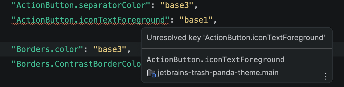
Karol Lewandowski Following up to let you know the property you mentioned is, in fact, correct. My mistake was attempting to apply it in the ui theme json instead of the color scheme xml. Ultimately that makes sense since these buttons are within the editor but I was confused as most ActionButton properties (or any ui element for that matter) are modified in the ui theme json.
<option name="ActionButton.iconTextForeground" value="…"/>Thank you, resolved my issue.