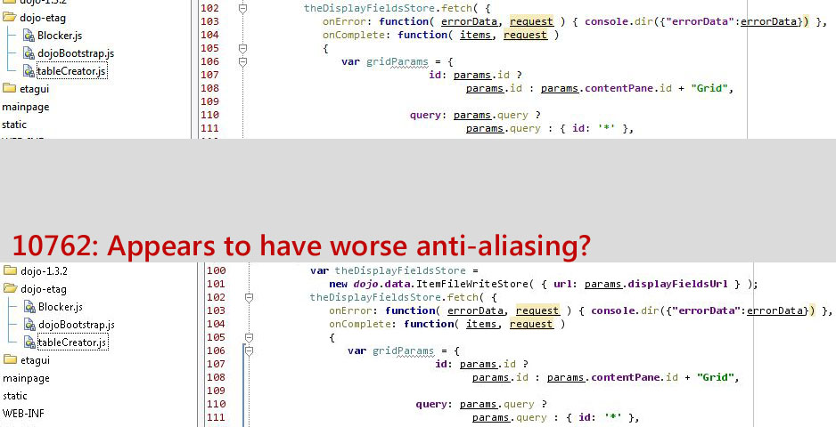
Fonts look worse moving from 10666 -> 10762
The settings are the same (including anti-aliasing), but the fonts in the 10762 look markedly worse (IMHO) than 10666. (Comparsion screenshot attached)
Attachment(s):
IDEA_10666_10762_fonts.jpg
Please sign in to leave a comment.