New text links - usability problems
Hi,
Maybe you have noticed the new, blue-highlighted text-"links" on
different places in Aurora. This might look cool and up-to-date but is
completely counterproductive in the meaning of usability (see the
DONT-DO-THIS-attachments). Did you tried to invoke the text-"link" with
keyboard-only? It does not work.
It is so easy to replace the link with an ordinary (text-)button. Then
everything would be usable from keyboard, too.
Jetbrains, please do not ignore the severity of this issue. The user
interface is not the right place to try new, "innovative" features.
Users expect GUIs, that contain accessible and known controls.
IDEA had a strenght in usability in the past, don't gamble away this
advantage!
Tom
Attachment(s):
example-screenshot.png
another-example-screenshot.png
Please sign in to leave a comment.
>>a) The File Open dialog has a cancel button, although creating
>>directories, deleting files is not cancelled...
See explanation below.
> Personally as a user I would be VERY
> surprised if it canceled filesystem operations.
I agree. The problem is not, that the dialog does not restore the
situation before opening it. The problem is, that the buttons are
incorrectly labeled. NEVER use a cancel button if you cannot restore the
original situation. Instead name it "Close". And to make it right, the
other one not "OK", but - depending on the context - for instance "Open"
or "Select" or something else.
Tom
Ok, I tend to agree with that.
--
Valentin Kipiatkov
JetBrains, Inc
http://www.intellij.com
"Develop with pleasure!"
"Thomas Singer" <idea@NOregnisSpam.de> wrote in message
news:bk11cj$d6m$1@is.intellij.net...
>
>
>
>
>
The link-madness continues. Wouldn't be it more intuitive to just put a Configure button at the attached page?
Tom
Attachment(s):
link-hack.png
I completely agree that links are good as optional navigation or shortcuts for the actions that are available anyway through the menu/keyboard, not as the only way to continue interaction with the dialog.
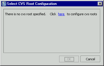
Considering your screenshot with the "Click here to configure CVS root" (in your firts post) I'm wondering what is the reason of displaying this dialog at all. It is much more "intuitive" not to display empty list of CVS roots, but immideatly display root configuration dialog when there is no CVS root configured and user tries to check out something from the CVS.