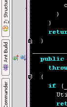
New overrides/implemented icons in gutter
They're getting better, but the new ones have that antialiased look
about them which makes them more blurry than they should be IMO. I
think the letters need to be fully black, and the balls could be a pixel
bigger without increasing the overall icon size.
Take a look at the attached files, what does everyone think?
Attachment(s):
suggestedicons.png
currenticons.png
Please sign in to leave a comment.
I don't think the circles need to be bigger, but indeed they could looke more crispy, as you demonstrated.
Agree. I find the suggested are much less blurry.
+1
Maybe just use arrows?
Down and Up fat arrows. Blue for class member overrides and gree for
interfaces?
--
Alexey Efimov, Software Engineer
Sputnik Labs,
http://www.spklabs.com
"Nathan Brown" <nedski@yahoo.com> wrote in message
news:bk4fh3$hp4$1@is.intellij.net...
>
>
-
-
-
-
Yes I suggested that a while ago too, does make sense, I suppose they
might have already tried it and not liked it...
Alexey Efimov wrote:
Please, not bigger.
That doesn't work good with editor settings with smaller
fonts (and less than 1.0 line scaling).
Or should there be different ones for small line height?
r.
Nathan Brown wrote:
The changes that I did had no effect on the overall size of the icon,
but just used originally blank space within the bounds.
Richard Nemec wrote:
>> They're getting better, but the new ones have that antialiased look
>> about them which makes them more blurry than they should be IMO. I
>> think the letters need to be fully black, and the balls could be a
>> pixel bigger without increasing the overall icon size.
>>
>> Take a look at the attached files, what does everyone think?
>>
>> -
>>
>>
>> -
>>
In the attached file you can see my problems:
the breakpoint icon that already is bigger gets covered by
the other line. In other cases, part of a removed breakpoint's
icon stays in the line above.
r.
Nathan Brown wrote:
>> Please, not bigger.
>> That doesn't work good with editor settings with smaller
>> fonts (and less than 1.0 line scaling).
>> Or should there be different ones for small line height?
>>
>> r.
>>
Attachment(s):
icons.bmp
+1 for arrows
Reserve the "balls" for breakpoints. But make the breakpoint "balls"
smaller! With ProFont 9, they are too large and cover 50% of the above
line as well.
Tom
That annoys me as well. Maybe they should make sure the icons shrink if
their height is greater than the line's height. I'd rather deal with
not-so-nice scaled icons, as I don't like the icons being drawn on the above
line or overlapping each other.
Has anyone filled in a tracker request for this problem (so I can add some of my votes)?
Andrei