Find in Files - terrible contrast on file names

Who came up with the foreground/background colors of the file names on the right and how do we tell them they should never design an interface again?
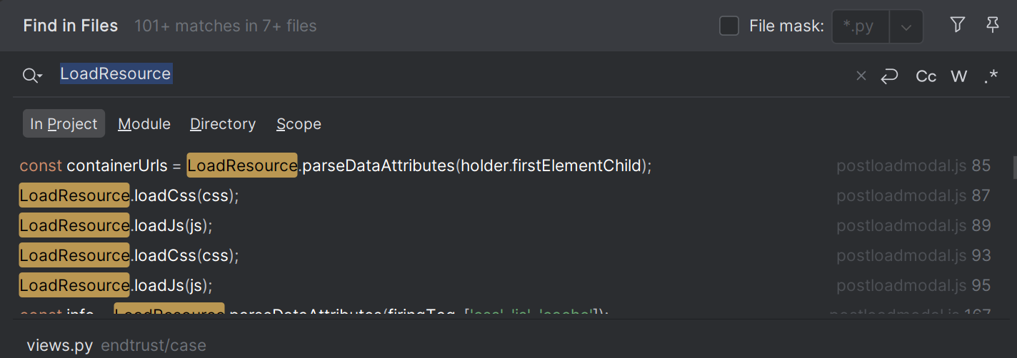
Could you choose any more grey - any farther from LEGIBLE, CONTRAST?
What option can I set to change these colors? If there isn't one, can a feature be added to Settings to allow me to fix this? Or even better… just fix it in the light and dark themes?
Please sign in to leave a comment.
Hi Chris
We have an old ongoing case regarding this:
https://youtrack.jetbrains.com/issue/IJPL-50059/Find-in-Path-Find-in-Files-Foreground-Color-for-Duplicates-Not-Legible
Unfortunately, there is no way to change the colour scheme specifically only for Find in Files.
We apologize for the inconvenience.
As a workaround, if you are OK with making many UI elements contrasting, try creating a custom theme plugin with the following settings:
I have reached out internally to raise the youtrack ticket priority but also feel free to comment/follow for further updates.
Kind regards,