Compare view highlight colour?
已回答

Is there a way to change the highlight background colour in compare panes?
I know the changed lines background can be changed via the settings, colors & fonts and diff section. But the compare pane uses two background colors it seems one for the line thats changed, then a slightly brighter version of that to highlight the chars in the line that differ. It's this 'slightly brighter' colour I want to change as I'm finding the contrast far too slight to spot the critical sections in each line that actually differ?
Not sure if its a dark scheme kind of problem, or my monitors calibration or my age. But I could do with changing it.
请先登录再写评论。
I assume you are referring to the "added" highlighting when the "Highlight" option is set to "By Word". I do not believe there is an option to set this color. If you change the background color in the settings, colors & fonts and diff section (say to purple), then both colors change. It looks like the color set is used for the highlighting of the word, and then IDEA programmatically creates a lighter version of the color for the rest of the line. I do see a bit more contrast when I make the set color darker. For example:

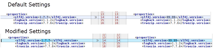
Of course in this example, the set color is so dark it's almost impossible to read the words it is highlighting. But you may be able to darken the colors slightly in the settings to get to a desired level of contrast. For example:
You could also open a feature request asking for control over the amount of contrast/color-change applied to the modified color.
Ok thanks, I've tried a few combinations of the diff background and it's a bit better if I don't use dark blues and add some red & green. But I'm using a dark theme, with dark diff colours so the contrast still isn't very marked. Ideally I'd like to be able to set a colour which should be workable with any theme light or dark setting a percentage darker or lighter at a pinch.
Has an option been added to change the diff background. Here is another example of how difficult it can be to spot differences.
There are options in Settings(Preferences) | Editor | Color Scheme | Diff & Merge (e.g. check Important / Ignored attributes for Changed node).
Anyone looking for a way to change the background colour of the Diff & Merge side-by-side editor of Jetbrains Rider in 2026, it uses the background colour defined in Settings > Editor > Color Scheme > General > Text > Background in read-only files. It defaults to #303030 in Rider Islands Dark. I've changed mine by unticking the Background checkbox on the right, making it easier to read, especially useful for anyone with any type of visual disability.