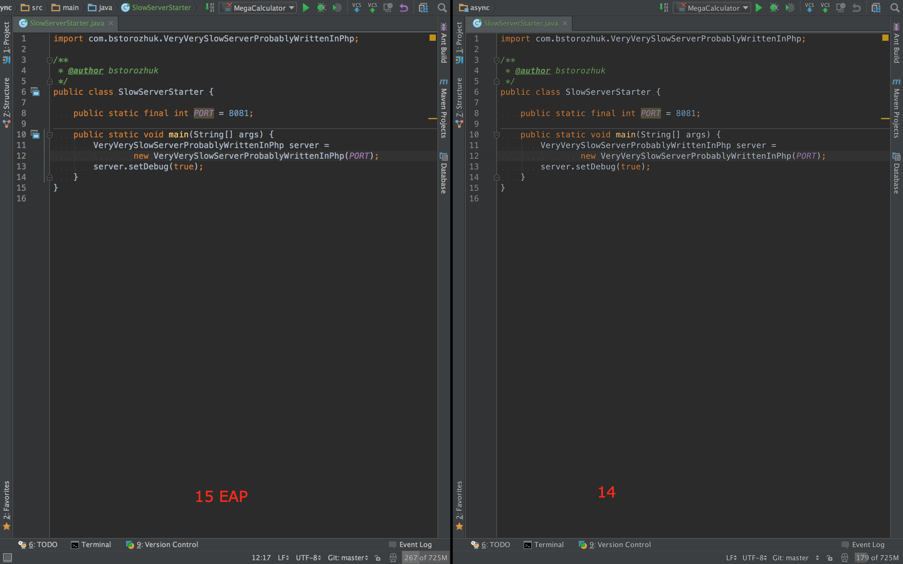
Font rendering and background color in 15 EAP vs 14
I am unable to use the "insert image" button ("an error has occurred"), so have uploaded two screenshots here:
1. http://i.imgur.com/paVyUCd.png (IDEA 14)
2. http://i.imgur.com/Sb459bm.png (IDEA 15 EAP)
Notice how the first, taken from IDEA 14 has a brighter background, and "thicker", more readable font rendering than the second, which was taken under the latest IDEA 15 EAP.
I've experimented with antialiasing options, changed underlying JDKs, etc, but cannot find a way to make 15 EAP look like 14.
Is this by design, or a setting I'm missing?
Attachment(s):
15.png
14.png
Please sign in to leave a comment.
Do you use JDK 1.8 (custom-jdk) bundle?
Yes, I am using the bundled JDK, because it was the only download of EAP 15 available on OS X. Switching away from the bundled JDK (using "Switch IDE book JDK") fixes the problem. I thought I had tried this before, but apparently I didn't actually switch.
Thanks.
I'm facing the same issue, fonts in the v15 EAP (patched java 1.8) looks bolder than in v14